In affiliate marketing your landing page is usually your best shot at converting a slightly interested user into a client. This means that landers are a crucial part of any campaign and a bad lander is as good as kills your performance. You may tweak the targeting all you like, change the audience, and search for new traffic sources, but as long as you don’t optimize your landing pages your campaigns are likely to sink.
Read the article to know more about the most important steps of landing page optimization!
Why do we need landing page optimization
Landing page optimization or LPO is the process of fine-tuning every element of your landing page to best suit the audience and to achieve the highest conversion rate. Landers usually have many elements inside as well as we do know that there are many do’s and don’ts when it comes to bringing those elements together. At first it may be difficult to see which little thing may be driving your affiliate game down. Let’s break a lander down into the logical bits.
From a scientific perspective, there is a conversion pyramid developed by the Eisenberg brothers. It shows all the steps a user has to take in order to become a buyer. The same would apply to your landing pages as the user passes these steps on the way to the conversion.
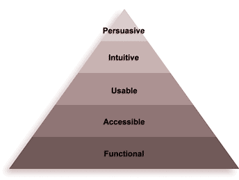
- Functional: your landing page must show a smooth performance and have no glitches or any other issues that may interrupt the user experience.
- Accessible: this point includes your SEO or creatives that make the landing page easy to find. Accessibility also means that your landers are equally well-optimized for any device.
- Usable: quite similar to being functional, your landing pages should be understandable and easy to comprehend. This means less flashy banners, moderate color palette and, again, smooth user experience from the technical point of view. For example, for mobile devices it is better to place any actionable buttons in the lower part of the screen as big-screen devices make it hard to reach the top of the screen with one hand.
- Intuitive: the elements on the page should be organized in such a manner that any user would find your main idea evident.
- Persuasive: the main goal of any landing page is, obviously, to convert the visitor into a buyer, so the page should show a good deal of persuasion.
And it’s the point of landing page optimization to make all these important steps work to your advantage.
Best practices for LPO
Here we have a selection of tips to enhance your affiliate performance through your landing pages. This is not a hierarchy, the points are equally important and all contribute to making a top lander.
Make your point clear
First, the user does not come to your page to kill some brain cells trying to figure your offer out. If you are not obvious enough — you lose the customers. Make your offer clear, the headline is your best tool for that as it is the first point that grabs attention. Try standing in your audience’s shoes and understand what pains them. Then offer a solution to that issue and state it clearly.
And bear in mind that one lander = one offer = one goal. Don’t try converting the same person to an email subscriber, a buyer, and an online player all at once.
Also, be careful to use simple language, avoid scientific terms and abbreviations or at least use them in moderation. Use simple sentences to showcase how the product solves the audience’s issue. So that they wouldn’t have to figure this one out too.
Be concise, avoid the clutter
If your lander is too heavy on the text it will become tiring for the visitors. And no affiliate would want to scare the audience off. Sure, you have to provide enough information to sound credible, but copy is not the only way to do it. You can use graphs, images, even videos to tell the story of your product and its properties.
Although, here lies another danger of going too far into illustrating. Too many images create clutter and make the same info noise the abundance of text did. Keep your balance, be simple yet informative. This takes experience but you can do it.
Place the big hits above the fold
The term above the fold refers to the upper part of the page that is visible to any user without scrolling down. The information you place there must ensure that the visitor is interested enough to read on and ultimately perform the target action.
Use contrasting colors
This point also requires caution and balancing. We do not want to make a jumble of colors, remember? But a plain looking page is not an option either. Another little game changer — use a contrasting color on important elements (e. g. call-to-action buttons, brand name, special promotions) to make them stand out. Thus, it’s easier to catch the user’s attention and get that click on your affiliate link.
Make your CTAs stand out
Linked to the previous step — the CTA must be clearly visible and really obvious. But it also must be simple, e. i. suggest a straightforward action, and understandable: the user must know what they are getting into by clicking on the button. So, you should provide enough content: for instance, you promote an SPF cream and offer a discount in case the user buys two items. You say so on the page and place a CTA “Get discount”. And one more point about the CTAs: they should be consistent throughout the page: carry the same message and refer the user to the same page upon the click.

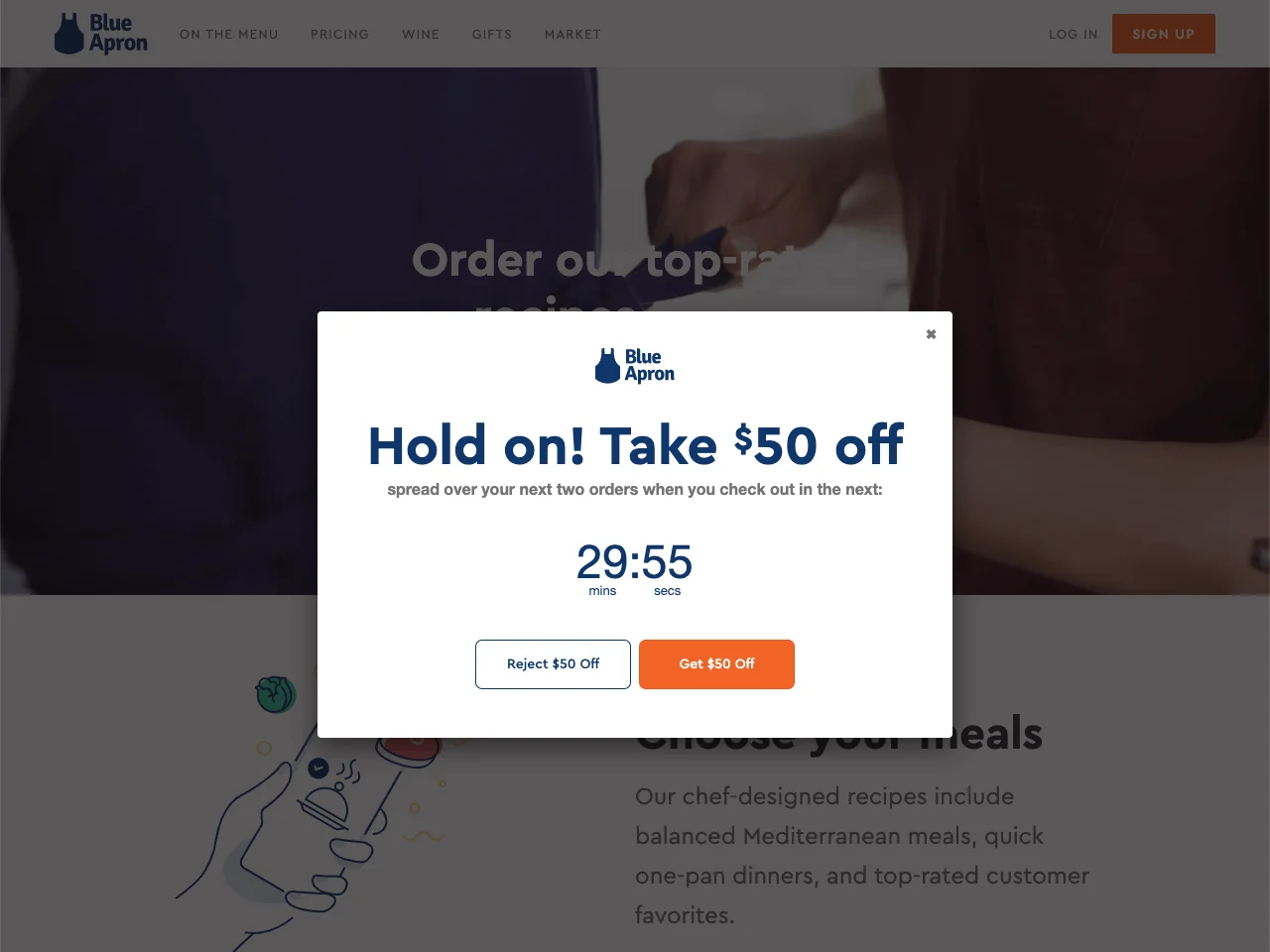
Make them an offer they can’t refuse
As an affiliate marketer, you have the power to make your offer limited (even if it’s not so with the brand) and add an element of urgency. This can be limited in time or scarce in quantity. Only one left, promotion until tomorrow, will never happen again, grab it while it’s still here — this kind of messages. The notorious fear of missing out (FOMO) is always with us nowadays, and a limited offer is the right trigger to turn the undecided visitors into clients. To add a visual element to this technique, use a timer, or pop-up messages conveying the idea: “10 more people are considering buying the same product that is running out fast!”.
Use social proof
Any new visitor to your website may be in two minds about purchasing the product you offer. It may be super cool, but they just can’t be sure it’s for them. To get rid of those doubts, use reviews and testimonials from happy customers. This is called user-generated-content (UGC) and it works wonders. It can be a short thank you, a full review, and unboxing video, a vlog showcasing the achieved results, etc. Anything that proves that your product solves the issues of the customers. So, it’s important to keep the testimonials relevant. They have more credibility if you post a photo of the happy customer and their name.
Add a FAQ section to address doubts
To save the page from a clutter of information and to boost your CR, dedicate a special section to frequently asked questions. There you can expand upon the features of the product, link some social proof, and get into more detail about the terms of your offer. And all that will keep your main page clean and easy to comprehend.
Make your pages load faster
The abundance of offers makes the demand side, e. i. users, rather impatient. If your page is not at their disposal in split seconds, there is a high chance that they will not wait for it. And at this point all the work you’ve invested into your lander goes down the drain. Google provides many great tools and tips for affiliates, check out their PageSpeed Insights and make your pages fly
If you want to reach new GEOs and audiences, maybe it is all waiting for you on Telegram? We’ve prepared some material about Telegram audiences. What are the messenger’s users like this year? How old they are, what they do, and what they are interested in!
A/B test the elements
A/B testing or split-testing is king in the affiliate industry, but it’s not just for creatives and such, it is also an important part of your LPO. Test the headlines, the banners (the number, size, and placement), the color palette, the location and number of CTAs, etc. Testing is the way of learning and improving your performance. So schedule some testing sessions for your landing page and keep on discovering the best way to convert your audience.
This is not an exhaustive list, but it’s a starting point to make your optimization journey easier. Here is a quick checklist of improvements that you can apply to your landing pages right away:
- clear ideas
- simple language
- obvious CTAs
- moderate colors with several highlights
- main points at the top of the page
- limited offer
- social proof
- Q&A section
- loading time
- scheduled A/B testing
Implement these tips to your lander and see how your performance improves!