Before embarking on your email campaigns, we highly recommend reading our article on newsletter design. In this piece, we delve into the key strategies for creating visually captivating and highly effective emails. Let’s get right to the point!
You probably realize that a user notices the visual elements first, and only then reads the text. The structure of the email, the illustrations, the formatting of the text, the color scheme, the ease of reading on a smartphone — all this determines whether the recipient will read the email to the end and take the desired action.
Obviously, users don’t like emails with design and layout errors and often send them to the spam folder.
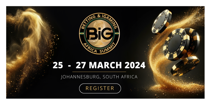
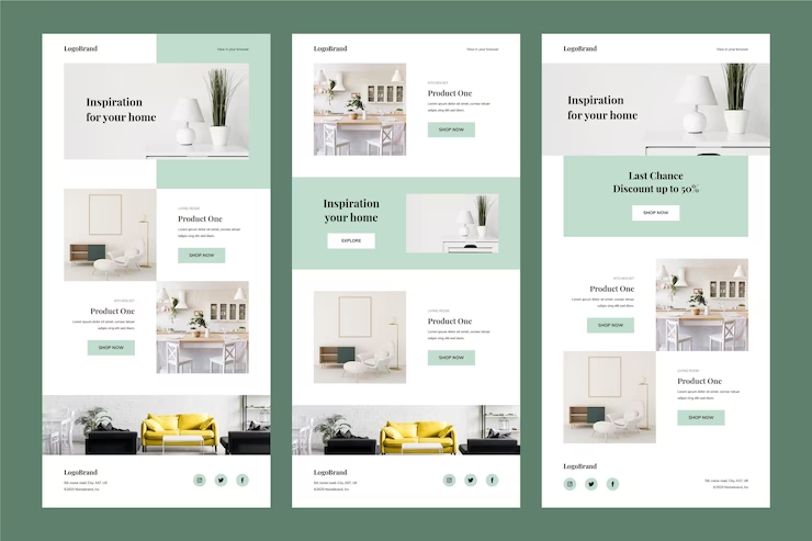
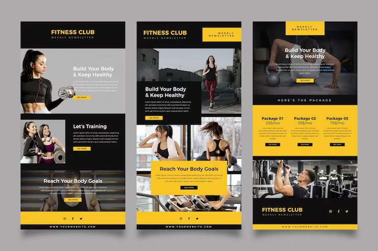
![]()
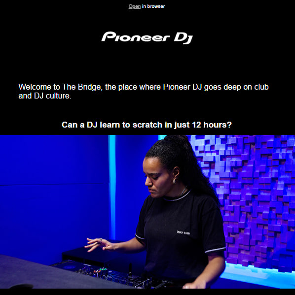
Email newsletter template design
The basis of an email is a template. It is designed in a way that matches the style of the target website, so that the user can associate the letter with the company. You should be very careful when designing a template, as it will determine the structure and appearance of your newsletters in the future. Thus, what should you do to create an attractive and effective template design:
- Create a corporate template that aligns with the site’s style or brand book, enhancing brand recognition and building trust among recipients.
- Test each element of the email newsletter design, rather than the entire template. In this way, you can track the effect of changes, and the company’s image will remain recognizable to subscribers.
- Develop a clear and logical structure for the email, placing the primary advertising or informational message within the first screen for maximum impact.
- Maintain a width of 600 px for the email. This way, the email will appear on the screen of any email service without horizontal scrolling.
And here are also some points not to spoil your newsletter at the template’s creation stage:
- Don’t change templates too often. If the subscriber receives a differently designed letter every time, it’s hard for them to remember the company’s image.
- Don’t use a corporate color as the main color if it’s too bright. It seems logical to design the header and the letterhead in the company colors.
- Avoid using images as the primary text in your email newsletters as they may not always display correctly. This can lead to important information, such as promotional codes, being inaccessible for readers to copy and paste. Additionally, relying solely on images for the entire email content can increase the likelihood of email services categorizing it as spam.
- Don’t neglect adaptive design in email newsletters. Pay attention to it and take into account all the nuances of adaptive layout.
Text in email newsletter design
Even the most interesting text may be ignored if it looks unattractive. And vice versa, the breakdown of the text into paragraphs with subheadings, highlighting the main ideas in color or other font helps to attract and hold the reader’s attention. However, in an effort to beautifully prepare the text, you can make some mistakes:
- Avoid using too many design elements in a single email, such as different fonts, excessive color separations, and inconsistent font sizes. This can make the email appear cluttered and unprofessional, and email services may flag it as spam.
- Ensure that the fonts you use are easily readable, even at smaller sizes. Avoid using small or faint fonts that may strain the reader’s eyes or make the text difficult to comprehend.
- When including links in your email, make sure they are adequately spaced and not too close together. This will prevent them from overlapping or being difficult to click, especially when viewing the email on a smartphone or other mobile devices.
Color in newsletter design
The color of the letter amplifies the advertising message. But if you make a mistake with color in your mailing, you can get the opposite effect. For example, you may dazzle the reader with color — too much red, using bright or mismatched colors spoils the appearance of writing and makes it difficult to read.
If you want to use colors correctly, the following points could help you:
- Use bright colors as an accent for important elements. Make the top banner and footer in quieter tones.
- Consider the features of your product and target audience when choosing the color design of your letter.
- Conduct A/B testing to determine the more effective color of the mailing list items.
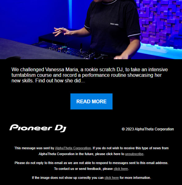
Header design
The header is a block at the top of the email, above the main picture. It usually contains the logo, links to the site sections, and contact information. The header helps identify the email: the reader sees the brand name in the “sender” field, and when the email is opened, they see the logo:
The common mistakes in the header are:
- Too much information
- Poor-quality pictures
These will spoil the appearance of the email and give the impression of an amateurish newsletter design.
 |  |
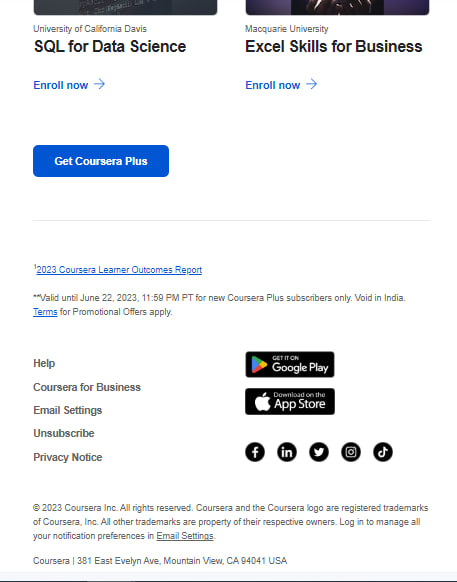
Footer design
The most subtle, but still important element of the email is the footer. Most often it contains a signature, an unsubscribe link, an explanation of why the subscriber received the newsletter, the physical or legal address of the company, and links to social networks. How to work on the footer:
- Add to the footer the information that is really needed. Group the links by meaning to make them easier to read.
- Try adding a friendly caption to the footer so the reader ends up reading on a pleasant note and wants to open the next newsletter.
- Don’t hide the “unsubscribe” link. If the reader has difficulty unsubscribing, he or she will send the email to spam. And complaining about spam will damage the reputation of the sender.
 |  |
CTA design
A call to action in an email newsletter is a button or link that encourages the reader to perform a targeted action: register for a webinar, buy a product on a website, fill out an application form. A clear call to action and its correct placement in the email helps to increase CTR. But mistakes can make the letter useless, so before you send your newsletters, fix this:
- If you have one call-to-action button, don’t hide it at the bottom outside the first scroll screen. A person may simply not read the email to the end.
- Make the button contrast with the letter design. The call to action should stand out well against the text and images.
Conclusion
Prioritize effective newsletter design to capture subscribers’ attention and boost click-through rates. Create a cohesive template, format text attractively, use colors wisely, design clear headers and footers, and place call-to-action buttons strategically. Elevate your email campaigns with thoughtful design for increased engagement and brand recognition.
If you want to reach new GEOs and audiences, maybe it is all waiting for you on Telegram? We’ve prepared some material about Telegram audiences. What are the messenger’s users like this year? How old they are, what they do, and what they are interested in!