A landing page describes the USPs of a product or service and encourages users to perform a target action. In short, its end goal is to convert visitors into leads or sales. Webmasters often use ready-made landing pages, which makes them prone to the risk of getting a low conversion rate. This is because a lot of websites are poorly designed. If you want your landing page to convert, it is better to create and test it yourself and fix all the bugs. It can be difficult to identify what exactly you need to change if you run traffic to third-party landings.
This article aims to break down the most common web page design errors and how to avoid them.
Content
Chances are your landing page fails to bring sales due to a poor USP. Your website needs to have a clear headline immediately setting your product or business apart from others. Another common error is mistaking the USP for keywords. Let’s say you’re advertising professional teeth cleaning. In this case, you need to use thematic keywords in the description. However, be sure to mention a discount coupon for the procedure as part of your USP to attract the user’s attention.
Make sure you use relevant keywords if you run SEO traffic. Run keyword research to identify the top words people use in their searches and include them in your headline. For more accurate results, segment your target audience into smaller groups depending on a search query to successfully reach your potential customers. This will also allow you to come up with a separate USP for each user.
You don’t have to use lengthy headlines. Try to craft clear, concise ad copy. Users need specific information to make a buying decision, so shorten your sentences and provide facts.
![]() Get the whitest teeth ever, claim your discount coupon for professional teeth cleaning
Get the whitest teeth ever, claim your discount coupon for professional teeth cleaning![]() A discount coupon for professional teeth cleaning
A discount coupon for professional teeth cleaning
Also, try to avoid emotionally-loaded vocabulary and evaluative statements: let the user decide on the product’s quality. You can use evaluative language in your ad copy draft but you need to replace it with fact-based statements in the final version.
![]() Effective
Effective![]() Get results in five days
Get results in five days
Webmasters tend to overuse the imperative mood on their landing pages. Calls-to-action such as “Order”, “Click here”, etc. make users feel that they are hastily being forced to perform an action instead of attracting their attention and sparking their interest.
![]() Skyrocket your sales
Skyrocket your sales![]() We will help you skyrocket your sales
We will help you skyrocket your sales
Buttons, pop-ups, and offers
A landing page aims at turning visitors into converting customers. At the end of the day, it’s not about sales. It’s about informing users about the product, and many affiliates forget about it. Hence, the mistakes in call-to-action buttons.
![]() Buy
Buy![]() Learn more
Learn more
Words like “Order”, “Get money”, and “Buy” are effective for short-term emotion-driven sales and promoting products such as pizza or microloans. They can also be found on product landing pages in some CPA networks. However, other categories of products and services require a different, more simple target action. Moreover, your call-to-action should match what the button says, that is, if your order form says “Order for free”, then you can’t use the “Discount” button.
As for pop-ups, a single window popping up when the user clicks on a button or leaves your landing page is more than enough. Lots of pop-ups = annoyed users = low conversion rate.

The same applies to offers: people don’t like to choose between lots of options unless it’s a shopping mall. Don’t put several offers in a landing page, one is quite enough. This way your landing page will be more effective conversion-wise and help the user make the right choice:

If you want to reach new GEOs and audiences, maybe it is all waiting for you on Telegram? We’ve prepared some material about Telegram audiences. What are the messenger’s users like this year? How old they are, what they do, and what they are interested in!
Web design
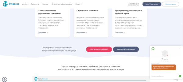
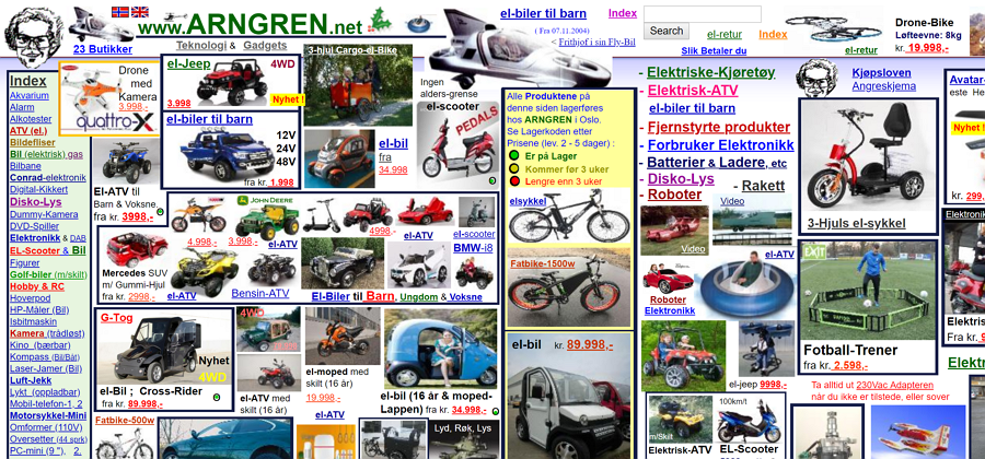
A website with numerous design elements placed chaotically is difficult to navigate and extremely frustrating. Affiliate marketers (and not only them) sometimes add too many elements and use too many colors, which makes the site look messy and overloaded.

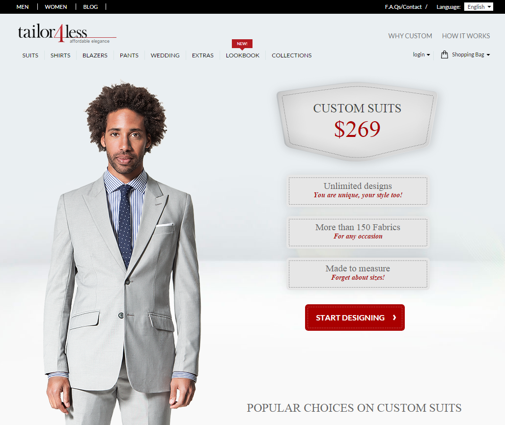
Again, this is all about directing users’ attention to what is most important. A well-designed landing page is user-friendly and easy to navigate. It has a clean layout and a good color scheme.

Usability
If you open a web page that is not mobile-friendly on a mobile device, some elements will be missing and the content won’t be displayed correctly. Your page must perform well on all devices.
If the content of your website is poorly organized, the user will get confused and leave the site immediately. Designing a mobile-friendly website is an absolute must. Tools such as Mobile-Friendly Test allow you to see how well your website performs on mobile devices.
A high converting landing page has a clean layout, a well-defined USP, and a clear call-to-action. If a webmaster follows these simple rules, they will be able to avoid the most common errors in landing page design and improve conversions.


