Icons play a vital role in digital marketing by conveying meaning visually across websites, apps, infographics, and more. To engage audiences effectively, icons should follow certain design principles. However, creating effective icons requires a deep understanding of fundamental principles and design techniques. Let’s explore seven core considerations for creating professional icon sets.
Why icon design matters
Icons are essential visual elements that play a crucial role in enhancing user experience across various digital platforms. They serve as a powerful tool for conveying meaning, functionality, and brand identity, and they can significantly impact the overall usability, accessibility, and aesthetic appeal of a product or service.

- Enhancing usability and intuitive navigation: well-designed icons can effectively communicate actions and functions, enabling users to quickly and easily navigate through interfaces. By providing visual cues that are universally understood, icons eliminate the need for extensive text descriptions, reducing cognitive load and enhancing the overall user experience.
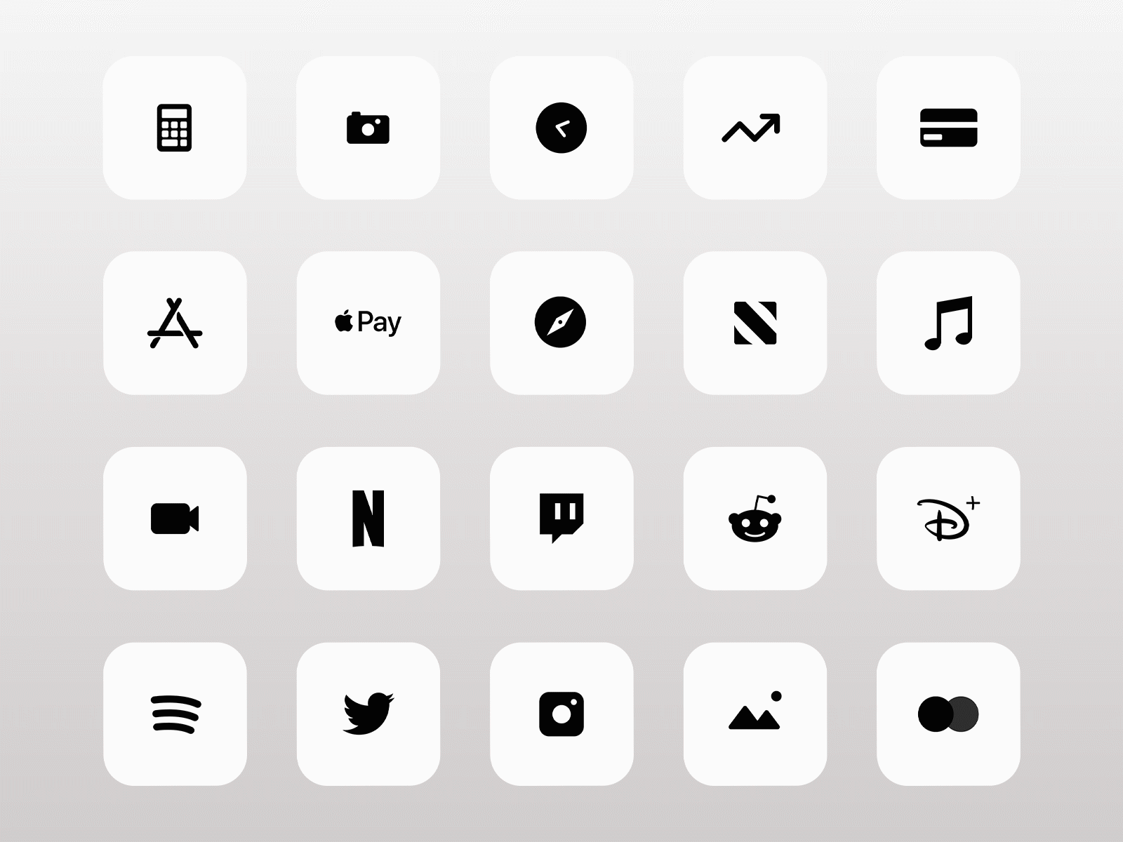
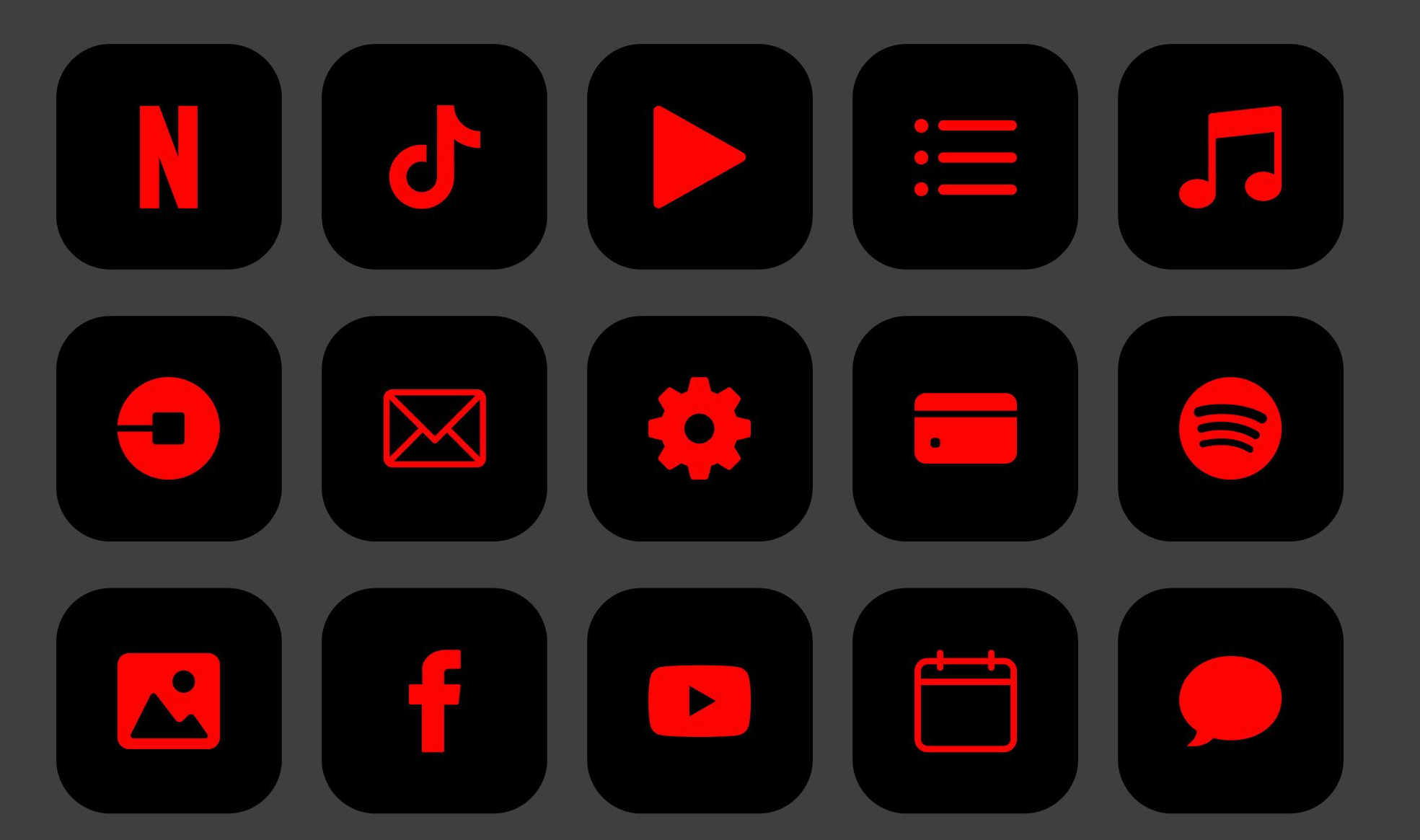
- Strengthening brand identity with visual consistency: a consistent icon set can effectively represent a brand’s personality and values, reinforcing brand recognition and establishing a cohesive visual identity across multiple touchpoints. By using a consistent style and color palette, icons can convey a brand’s unique essence and establish a sense of familiarity among users.
- Translating concepts and functionality across language barriers: in contrast to text-based interfaces, icons offer an unparalleled advantage in terms of global accessibility and inclusivity. As visual representations, icons transcend language barriers and can be understood by users regardless of their native tongue. This makes them invaluable for creating seamless user experiences for a global audience.
- Enhancing aesthetic appeal and engagement: icon design extends beyond functionality, playing a significant role in shaping the overall aesthetic appeal of a user interface. Thoughtfully crafted icons can add visual interest, vibrancy, and personality to a design, injecting charm and character into the overall experience.
- Pixel-perfect precision for scalability and professionalism: icons should be designed with pixel-perfect precision to ensure consistent appearance across varying screen sizes and resolutions. This level of detail contributes to a polished and professional brand image, demonstrating attention to detail and a commitment to quality.
- Minimalism for scanability and focus: while icons can add visual interest, it’s crucial to maintain a minimalist approach, avoiding excessive detail and clutter. Too many intricate elements can hinder scanability and make it difficult for users to quickly grasp the intended meaning of the icon.
- Distilling complexity into intuitive symbolism: effective icon design is about simplifying complex concepts into easily recognizable symbols. By using universally understood shapes, lines, and forms, icons can convey meaning immediately, fostering a sense of understanding and emotional connection with users.
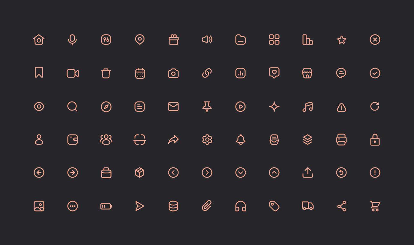
Consistent visual weight
Icons, despite their petite size, play a crucial role in user interface hierarchies. Achieving consistent visual weight among icons ensures that users can easily distinguish between primary and secondary actions, aiding navigation and usability. This can be achieved by adjusting the size, line thickness, color saturation, or overall complexity of the icons.
Example: Imagine a set of icons where one stands out as significantly larger than the rest. This incongruity not only disrupts visual harmony but also erodes the brand’s credibility.
Simplicity and minimalism
Icons thrive on simplicity and minimalism. By stripping away unnecessary details and focusing on essential shapes and forms, icons become more recognizable and memorable. Avoid cluttering icons with overly intricate details or gradients, as these can hinder legibility and clarity.
Example: Picture an animated icon set overloaded with unnecessary details. The result? Icons that appear heavy, confusing, and fail to resonate with the audience.
Creating icons with a consistent brand voice
Icons should seamlessly align with the overall brand identity, reflecting the brand’s personality and visual style. This consistency ensures that icons reinforce brand recognition and contribute to a cohesive user experience. Consider using the brand’s color palette, typography, and overall aesthetic to create icons that resonate with the brand’s essence.
Example: Consider a scenario where a brand uses diverse icon styles across various media. This inconsistency may create an impression of a shapeshifting, unreliable business.
Designing icons with enough white space
White space, also known as negative space, is an essential element in icon design. While it may seem counterintuitive, strategic use of white space can make icons more impactful and visually appealing. White space allows icons to breathe, reducing visual clutter and emphasizing the icon’s essential elements.
Example: Envision a set of icons crammed together without adequate white space. The result? A chaotic and unprofessional appearance that undermines user experience.
Pixel-perfect design
Icons are typically displayed on digital screens, where pixelation can be an issue. To ensure that icons maintain their crispness and clarity, it’s crucial to design them with pixel-perfect precision. This involves paying close attention to line weights, proportions, and overall resolution to ensure that icons look their best across different screen sizes.
Example: Imagine encountering a set of icons that appear blurry on certain devices. This inconsistency detracts from the overall professionalism and cohesiveness of the brand.
Contrast & color palettes
Contrast plays a vital role in icon design, making it easier for users to distinguish between foreground elements and background elements. Use contrasting colors to make icons stand out and ensure that they are easily recognizable. However, consider the overall color palette of the app or website to ensure that icons complement the existing design.
Example: Visualize a scenario where contrasting colors are too dark, rendering icons nearly invisible. Alternatively, excessively light colors may clash with website themes, compromising user experience.
Geometric shapes have more influence
Geometric shapes are often preferred in icon design due to their inherent simplicity and universal understanding. Circles, squares, triangles, and other basic shapes can effectively convey a wide range of concepts and ideas. However, don’t shy away from experimenting with more complex shapes if they effectively represent the intended meaning.
Example: Envision an icon designed with haphazard free-form elements. This lack of structure may instill uncertainty in consumers and diminish their confidence in the associated content.
The bottom line
Consistency, meticulous attention to user experience, and a strategic blend of design elements form the bedrock of creating professional icon sets. Each principle, from maintaining visual weight to embracing geometric shapes, contributes to a cohesive, visually appealing, and trustworthy brand image. As you embark on your icon design journey, remember: every pixel matters, and each shape tells a story.
By adhering to the fundamentals discussed above, designers can create icons that are not only visually appealing but also functional, consistent, and aligned with the overall brand identity.
If you want to reach new GEOs and audiences, maybe it is all waiting for you on Telegram? We’ve prepared some material about Telegram audiences. What are the messenger’s users like this year? How old they are, what they do, and what they are interested in!