First of all, why do you need to bother with science, psychology, and all that stuff if you are a marketer and simply want to sell something?
They need it, you have it — end of story. Unfortunately, it’s not so simple as that anymore.
Today’s customers have so many choices thrown at them, that they don’t really care who they are buying from, as long as it’s convenient and cheap enough. And if you want your campaigns to get anywhere, you need to make an effort and create the best user experience possible.
Now, attentions patterns are a useful trick that will come in handy in many professional areas. For your purposes, these are studies of where people are trained (yep, trained by a myriad of similar templates they see and use online) to look and to click. You don’t need to reinvent the wheel to attract user attention — the human brain is lazy and it loves to use the same paths to save the effort. So, all you need to know has already been defined and written down. And we are going to guide you through some of these tips today. Buckle up!
Attention patterns
F, Z, reverse-S, ZigZag…
There is a huge number of studies dedicated to tracking users’ eye movement and establishing patterns for further use. It’s not hard to guess that an F pattern looks like this:
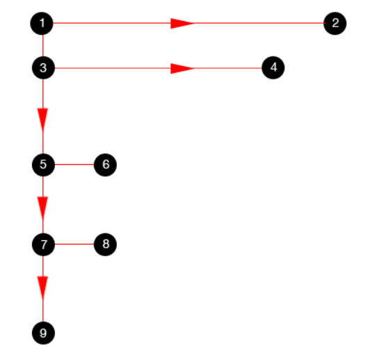
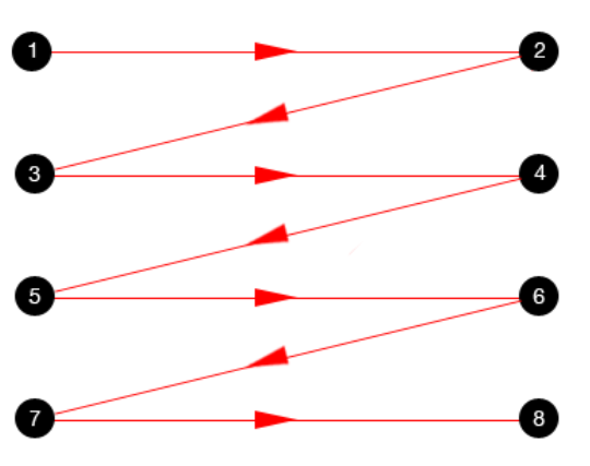
And this is a zigzag attention scheme:
And you, as a marketer, media buyer, or product owner are supposed to place your logo, CTAs, and other important elements based on the first attention points in these patterns. And you should also make it the highest points as well because users don’t want to be bored into buying things.
But. There are many of these patterns, which one to choose? Well, actually these studies are rather controversial. Sure, people who are used to reading from left to right will start their search from the upper-left corner of the “page” and vice versa for Arabic languages and such. But most of these patterns have been created before the advent of smartphones and the Internet how we know it today. You should make allowances for that and choose the right scheme for your type of content.
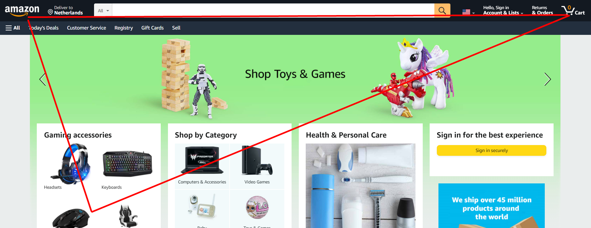
For example, the Zigzag pattern looks good for long reads, the F-pattern reminds us of a search results page, and the golden triangle is just like your average online store.
Gutenberg Diagram
This is another type of attention pattern that is more logical than geometrical. The diagram describes the general eye movement pattern for a page with relatively even homogenous content. There are four sectors:
- Primary optical area — top/left
- Strong fallow area — top/right
- Weak fallow area — bottom/left
- Terminal area — bottom/right
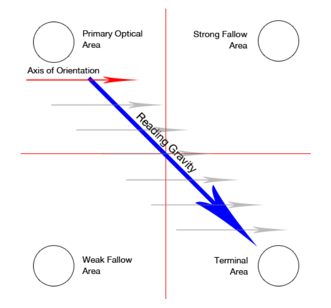
The main idea is, that a user sweeps across the page downwards, from the top left to the bottom right corner. The “follow” areas receive the least attention, therefore they are no good for important content like CTAs or USPs. Again, this pattern should be mirrored for people who are used to reading from right to left.
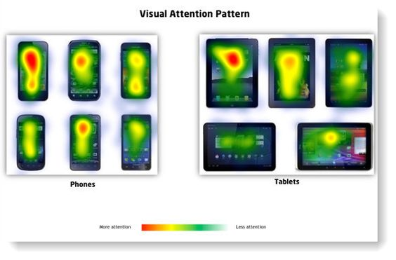
Desktop VS mobile
The patterns we have mentioned above are mostly relevant for desktop devices because people who have invented them had no idea that one day there would be the whole power of the Internet in the palm of our hand.
Attention patterns for mobile devices also follow the “how you read” rule and go downwards. However, the important text should be easy to find and read. It is better to locate it at the top of the page, at least no farther than one full scroll down from the top.
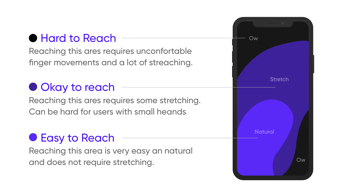
Clickable elements like CTAs need to be accessible, this is about the so-called “thumb zone”.
Copy that sells
Sure, actual placement within a page plays the key role for your copy’s viewability. However, the text itself should also be attention-grabbing and intriguing, or else. Here are a few tips on how to improve your copy.
Make a promise
In most cases, advertising sells a solution and not a product. So, make a promise to rid your customers of all that ails them (without exaggerating, of course). Explain why the product is so good, build up credibility, provide social proof and research.
Provide clarity
When a user opens your site they have several questions you have to answer: “where am I?”, “what can I do here?”, and “why should I do it?”. So your copy needs to say something like: “We are the biggest manufacturer of A. A solves your problem B. Here’s how you can make a purchase.”
Use meaningful headlines
Headlines are the most noticeable part of your copy.
So, your headlines should tell your users what this is all about. It’s okay to use puns and bank on user curiosity, but the useful information has to be there as well. Simply tell the visitors what you’re selling and why they should care.
Conclusion
Placement matters when it comes to copy, and there are many studies and approaches that tell you what to do in order to succeed. Take them into account, test them out and see if they work for your goals.
And since text is not the only important element of a landing page, check out our articles on landing page optimization and developing impactful creatives for more insights.
If you want to reach new GEOs and audiences, maybe it is all waiting for you on Telegram? We’ve prepared some material about Telegram audiences. What are the messenger’s users like this year? How old they are, what they do, and what they are interested in!