Affiliate marketing is a rapidly changing industry, and we have to adapt and overcome new challenges every few months. We see that the CPM prices are skyrocketing due to major changes to privacy policies among the big corporations. The major social media platforms have reported an average of 20–108% growth in CMPs over a year.
You might think that it leaves all the marketers in a sticky situation, but do not despair. The way to stay afloat is bringing your targeting and creatives up to scratch. Targeting is a complex issue that we will address some other time. Today we would like to talk about creatives, because when your creatives are more attractive and engaging, then you will simply need fewer ad impressions to get the user. Let’s take a peek at some important points that will make your creatives stand out.
Stick to one idea and avoid confusion
What can be easier than taking a picture of the product you promote or a photo of a happy customer and be done with it? Well, it turns out that choosing the right picture for your creatives may be a tad more complex than that.
Define the objective of your ad campaign and stick to it. Creative is not the right place to tell all about the product/service you promote. The space on creatives is limited and they are your first line of attack, so to speak: creatives are the first elements of your campaign that users encounter. This means no sideline information, one clear and loud message.
Use catchy images
Also closely related to the message and maybe the most important of all — the imagery itself. Did you know that great creatives do not always contain the image of the product? Great, because imagery is not about showing the thing, but conveying the idea. Don’t sell the product, sell the solution, that kind of thing.
Try to define the driving points behind your audience’s decision to purchase the product. These points are your core offering — show stories with happy endings. Also, be bright and catchy, but not pushy. Forget the hard sell, the market is well past that strategy. Depending on the vertical, use scroll-stoppers — bold images that will disarm the user and get that click.
Go easy on text
The audience nowadays has a much shorter attention span, more aware of the ads among the content, and has a high level of ad fatigue. This setup demands for lightweight advertising. So, we suggest going easy on the textual part when it comes to creatives and saving the detailed account of all the wonders of the product for the landing page. Go for a short medium-sized text message that conveys your main idea. It would be best if the pure image to text ratio is about 80/20.

Be dynamic
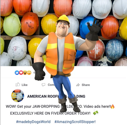
It may be difficult to stand out in a feed full of pictures. Using an out-of-the-box creative is one option (scroll up and wave back to that cheery construction guy). Another is using video, animated, or interactive ads — in other words, ads with movement. There are many options: a carousel, a time-lapse, a loop animation, a short video to bring up the best qualities of your product in action, etc. depending on your traffic source. Short is also a key term here — we do not want to bore the audience with an already limited attention span, do we? Keep it entertaining, bright enough, and under 10 seconds.
Use loud and clear CTAs
A call-to-action button or a CTA is an integral element of advertising as we prompt the users to act and click, buy, register, etc. The CTAs should be encouraging, catchy, noticeable. But it is easy to overdo it. So, keep in mind the previous tips — stick to one idea and once clear message per creative. Keep your CTA message short and actionable: “Buy Now!”, “Get discount!”, “Register today!” It would also be a good idea to make the CTA stand out color-wise, to use contrasting colors.
Optimize for different devices
Now in the year 2021 mobile device users account for a large share of the total audience, yet many people still prefer to use a desktop computer for browsing. Keep that in mind and optimize your creatives for different screen sizes and configurations. Locate the CTAs where they will not be overlooked.
Remember about the ease of use when it comes to smartphones. Statistically, the top of the screen and the upper left corner are hard to reach when holding a device with one hand. So, place the CTAs or interactive elements at the lower part of your creatives. And obviously, you will have to split-test the options, but usually vertical layout performs better for mobile devices while desktop users tend to favor horizontal pictures.

All in all, the most important point is to pay more attention to your creatives, seeing that the affiliate field is faced with new challenges once again. But this is the essence of this industry: it changes — we adapt. The evolution of affiliate approaches turns hurdles into fascinating challenges. And who doesn’t love a good challenge?
If you want to reach new GEOs and audiences, maybe it is all waiting for you on Telegram? We’ve prepared some material about Telegram audiences. What are the messenger’s users like this year? How old they are, what they do, and what they are interested in!